

Design system development services for consistent products at scale
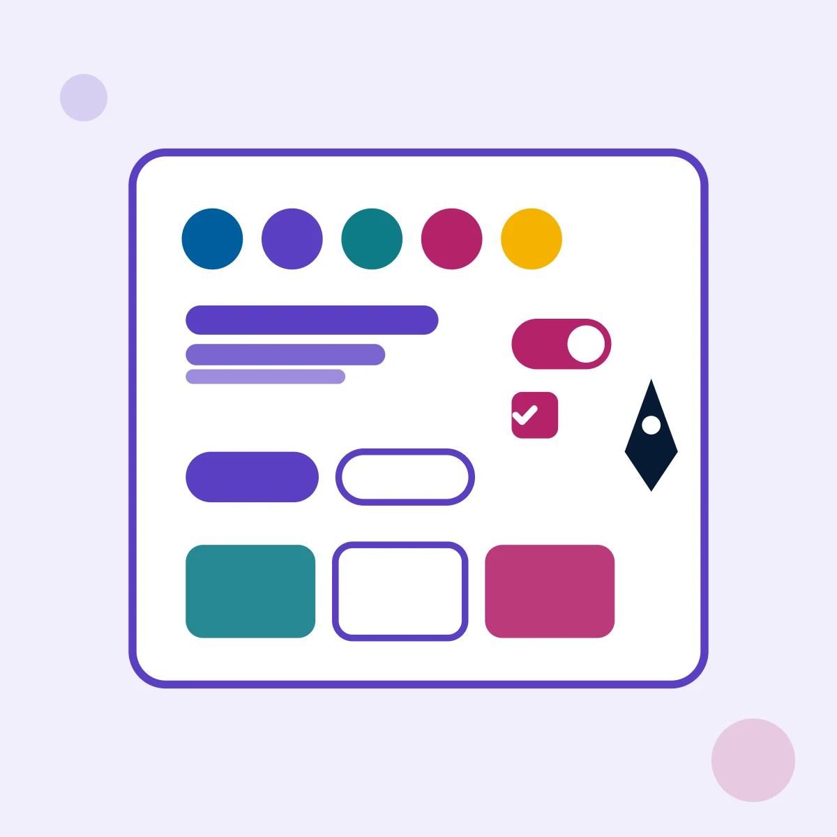
At AcmaSoft, we build design systems that keep every screen consistent: design tokens, a component library in Figma matched by coded components, usage documentation, accessibility built into each part and a governance model that keeps the system current as your products grow.
- Years of experience
- 17+
- Clients served
- 650+
- Projects delivered
- 2,000+
- Products shipped
- 300+
Why teams invest in a design system
When several designers and developers work on the same products, small differences pile up. Buttons come in five shades of blue, every form validates errors in its own way, and the same date picker gets rebuilt in each new project.
A design system replaces those one-off decisions with shared, reusable parts. Colours, type and spacing are stored once as tokens, components exist in both the design file and the codebase, and written guidance explains when to use each one. Designers stop redrawing basics and developers stop rebuilding them.
This page is about building and maintaining that shared system. To design a particular site or app, see our website design and mobile app design services; to organise content and user journeys, see information architecture and UX.
What you get with design system development
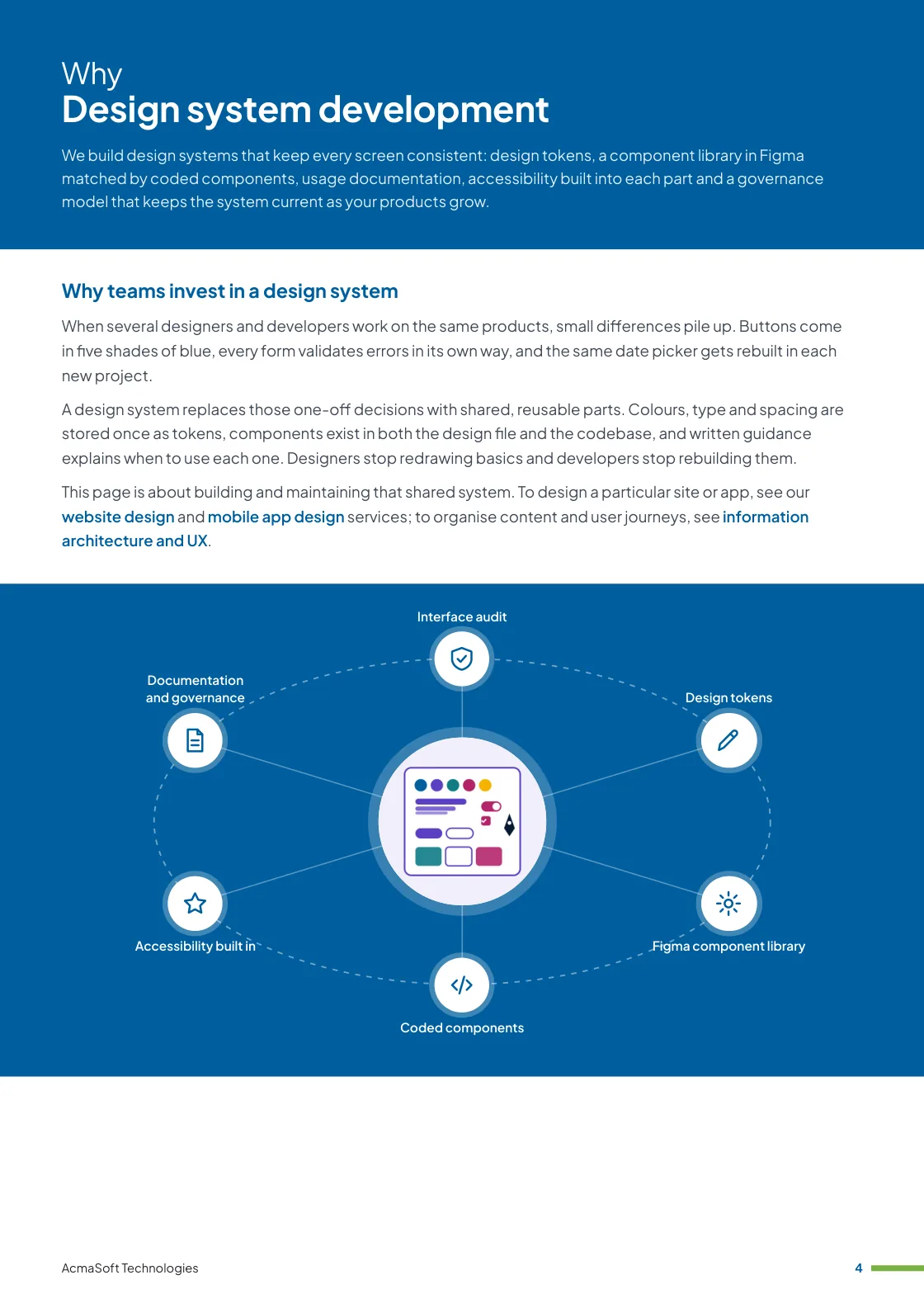
- Interface audit
- Design tokens
- Figma component library
- Coded components
- Accessibility built in
- One named lead from first call to launch
- Support and improvements after launch
More in UX and design
What our design system services cover
Six parts of a working design system, from an audit of what you have to the rules that keep it alive.
-
Interface audit
Starting from what exists
We collect the colours, type styles, icons and components already used across your products and list the duplicates and inconsistencies.
The audit shows which patterns to keep, which to merge and which to retire, so the system grows out of your real interfaces rather than a blank page.
-
Design tokens
One source for visual decisions
Colours, type scales, spacing, radii, shadows and motion are defined as named tokens in Figma variables and exported to code with tools such as Style Dictionary.
Tokens make themes such as dark mode or a second brand a change of values rather than a redesign.
-
Figma component library
Parts designers can trust
We build components with variants, properties and auto layout, so designers assemble screens from tested parts instead of detaching and redrawing them.
Each component covers its states, such as hover, focus, disabled, loading and error, and how it behaves on small screens.
-
Coded components
The same parts in production
We build matching components in the framework your teams use, such as React, Vue, Angular or Web Components, and document them in a workshop such as Storybook.
Visual regression tests catch unintended changes before a new version of the library is published.
-
Accessibility built in
Correct once, correct everywhere
Colour contrast, focus order, keyboard behaviour, screen reader labels and target sizes are designed and tested into each component against WCAG 2.2 level AA.
When a component is fixed, every product that uses it inherits the fix with the next update.
-
Documentation and governance
Keeping the system current
A documentation site explains each component, when to use it and when not to, with examples and code. Release notes and version numbers tell product teams what changed.
A contribution process sets out how teams propose new components and who decides, so the system stays shared rather than frozen.
What to look for in a design system partner
A design system is used for years by people who did not build it. Choose a team that offers:
-
Design and engineering together
Designers and front-end developers who work side by side, so the Figma library and the coded components match in names, properties and behaviour.
-
Adoption, not just delivery
A plan for moving existing products onto the system step by step, with training and support for the teams who will use it.
-
Accessibility knowledge
Experience testing with keyboards and screen readers, because an inaccessible component spreads the problem to every screen that uses it.
Ways to work with us
Choose the model that fits your scope and budget for design system development. Many clients start with one and move to another as the work grows.
-
Fixed price
A defined scope delivered for an agreed price and timeline, in milestones you approve.
- Best for
- Clear requirements, a fixed budget and a firm deadline.
- How it is priced
- One agreed price, paid in instalments tied to milestones.
-
Dedicated team
A team with a project lead that works only on your product, on the priorities you set.
- Best for
- Long-term products and roadmaps that change often.
- How it is priced
- A monthly fee per team member, based on role and seniority.
-
Time and material
You pay for the hours worked and can change the scope as you learn, in short iterations.
- Best for
- Requirements that are hard to fix up front, and ongoing improvements.
- How it is priced
- Hourly or daily rates by role, invoiced monthly against logged time.
Need UI and UX designers to join your own team instead?
Hire UI and UX designersWhat our clients say
More client reviews-
AcmaSoft transformed our app design, making it more user-friendly and efficient. Their dedication to perfection is evident in the results.
Laura B London
Industries our UX and design team works in
Our UX and design team builds for businesses in these industries, and we adapt design system development to each one's rules, systems and customers.


Technologies we use
We choose the stack for your budget, goals and current systems. Each link explains how we work with that technology or product.
Not sure which technology fits your project? Ask one of our architects.
Talk to an architectWorking with international clients
Our team delivers remotely, so the questions that matter are when we can talk and how the work is run. Here are our office hours beside yours.
Our office hours Monday to Saturday, 9:30 am to 6:30 pm India time (IST)
Evening hours for North American clients, by arrangement: Monday to Friday, 6:30 pm to 9:30 pm India time
| Your region | Our hours in your time | Shared working hours |
|---|---|---|
| UKLondon | 4 am to 1 pm | 9 am to 1 pm |
| Central EuropeParis, Berlin | 5 am to 2 pm | 9 am to 2 pm |
| US EastNew York, Toronto | 11 pm to 8 am (next day) Evening hours to 11 am | 9 am to 11 am In our evening hours, by arrangement |
| US WestLos Angeles, Vancouver | 8 pm to 5 am (next day) Evening hours to 8 am | No overlap Early calls 7 am to 8 am, by arrangement |
| GulfDubai, Abu Dhabi | 8 am to 5 pm | 9 am to 5 pm |
| Singapore | 12 noon to 9 pm | 12 noon to 6 pm |
| Australia EastSydney, Melbourne | 3 pm to 12 midnight | 3 pm to 6 pm |
Our day ends before yours starts, so updates are waiting each morning and we agree call times with you.
Times follow daylight saving where your region uses it, against a working day of 9 am to 6 pm. Messages sent outside our hours are picked up when the team is back.
-
Remote delivery
Research, workshops, reviews and prototype tests run over video calls, with shared design files you can comment on at any time.
-
How we stay in touch
Email, video calls and chat, with review meetings and the hours of overlap agreed at the start of the project.
-
Contracts and invoices
Proposals, contracts and invoices are in English and priced in US dollars, or in your own currency on request. A non-disclosure agreement can be signed before you share any details.
-
Accessibility
We test interfaces against WCAG 2.2 level AA, the standard that accessibility rules such as the European Accessibility Act and the ADA point to.
Questions about design system development
Something else on your mind? Ask us directly and a specialist will reply.
Ask a questionWhen does a business need a design system?
Usually when more than one team or product shares a brand, when the same components keep being rebuilt, or when a redesign is due anyway. A single small website rarely needs a full system; a style guide and a few shared components may be enough, and we will say so.
Can you build a design system from our existing product?
Yes, and that is the usual starting point. We audit the interfaces you have, keep the patterns that work, merge duplicates and turn them into tokens and components, so teams can move over gradually instead of starting again.
Which tools and frameworks do you use?
Figma for the design library, with variables for tokens, and the front-end framework your teams already use, such as React, Vue, Angular or Web Components. Components are documented in a tool such as Storybook, and tokens are exported with a tool such as Style Dictionary.
How do you make the components accessible?
Each component is designed and tested against WCAG 2.2 level AA: colour contrast, visible focus, keyboard operation, correct roles and labels for screen readers, and sensible behaviour when text is enlarged. Product teams still need to test full pages, because accessibility also depends on how components are combined.
Who maintains the design system after launch?
Ideally a small owning team inside your company, with contributions from product teams. We set up the versioning, release notes and contribution process, train the owners and can stay on to support or extend the system under an agreed plan.
Related insights
All insights-
 21 Mar 2024
What is web design? How it differs from development and UX
What web design covers, how it differs from UX design and web development, what a designer should hand over at…
-
 28 May 2024
Brand collateral and its importance: print, digital and keeping it consistent
What brand collateral to produce at each stage of the buying journey, how print and digital collateral differ, how to…
-
 8 May 2024
The 7 key elements of brand identity design
The seven parts of a brand identity, from logo, colour and type to voice, digital touchpoints and guidelines, with what…
Design system development brochure
We build design systems that keep every screen consistent: design tokens, a component library in Figma matched by coded components, usage documentation, accessibility built into each part and a governance model that keeps the system current as your products grow.
Inside this brochure
- Why teams invest in a design system
- What our design system services cover
- How a design system project runs
- Technologies and solutions
- 2.9 MB
- 10 pages
- Services
You have downloaded from us before, so this one needs no form.
Get the brochure
Tell us who you are and the download starts straight away. We remember you on this device for 90 days, so you only fill this in once.
Your download has started.
If it does not start, download the brochure here. The links work for 15 minutes.
- Your reference
- Brochure
What you can do next
- Read it and share itShare the brochure with your team before you get in touch. It is free to read and share.
- Get a quote when you are readySix short questions on our request a quote page, and a reply within one business day.
Start your Design system development project
Tell us what you are planning and a specialist will reply with next steps, a rough timeline and the questions we need answered.
- Emailsales@acmasoft.com
- Call+1 (707) 706 4092
- Prefer a call?
Thank you, your message is on its way.
It has reached our sales team, together with the page you sent it from.
- Your reference
- Budget
While we prepare your reply, here is the Design system development brochure.
Download the brochure, Design system development brochure, PDF, 2.9 MBWhat happens next
- A specialist gets in touchWithin one business day, by email or phone, with any questions about what you need.
- We talk it throughA short call about your goals, users, timeline and budget. We can sign an NDA first.
- You get a proposalScope, team, timeline and cost, with the engagement model that fits the work.